ECI Games
Branding for a heavyweight in the localisation industry.
Agency - Magick
Role - Graphic Design, Branding, Motion
Client - ECI Games
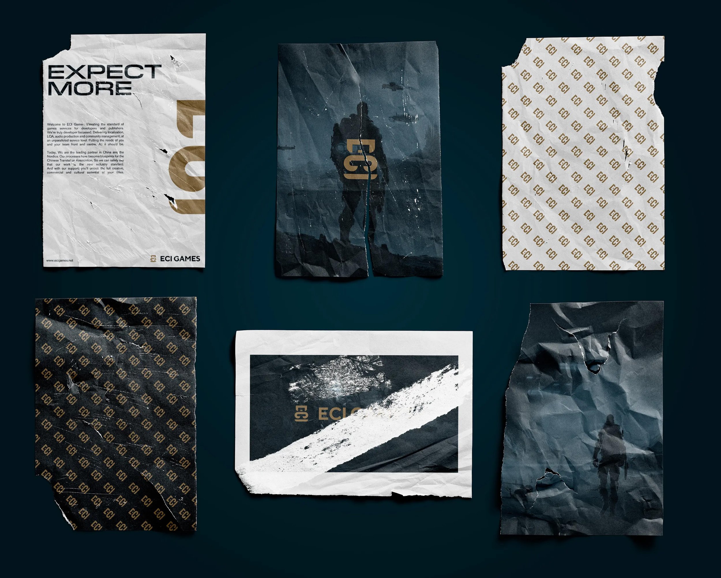
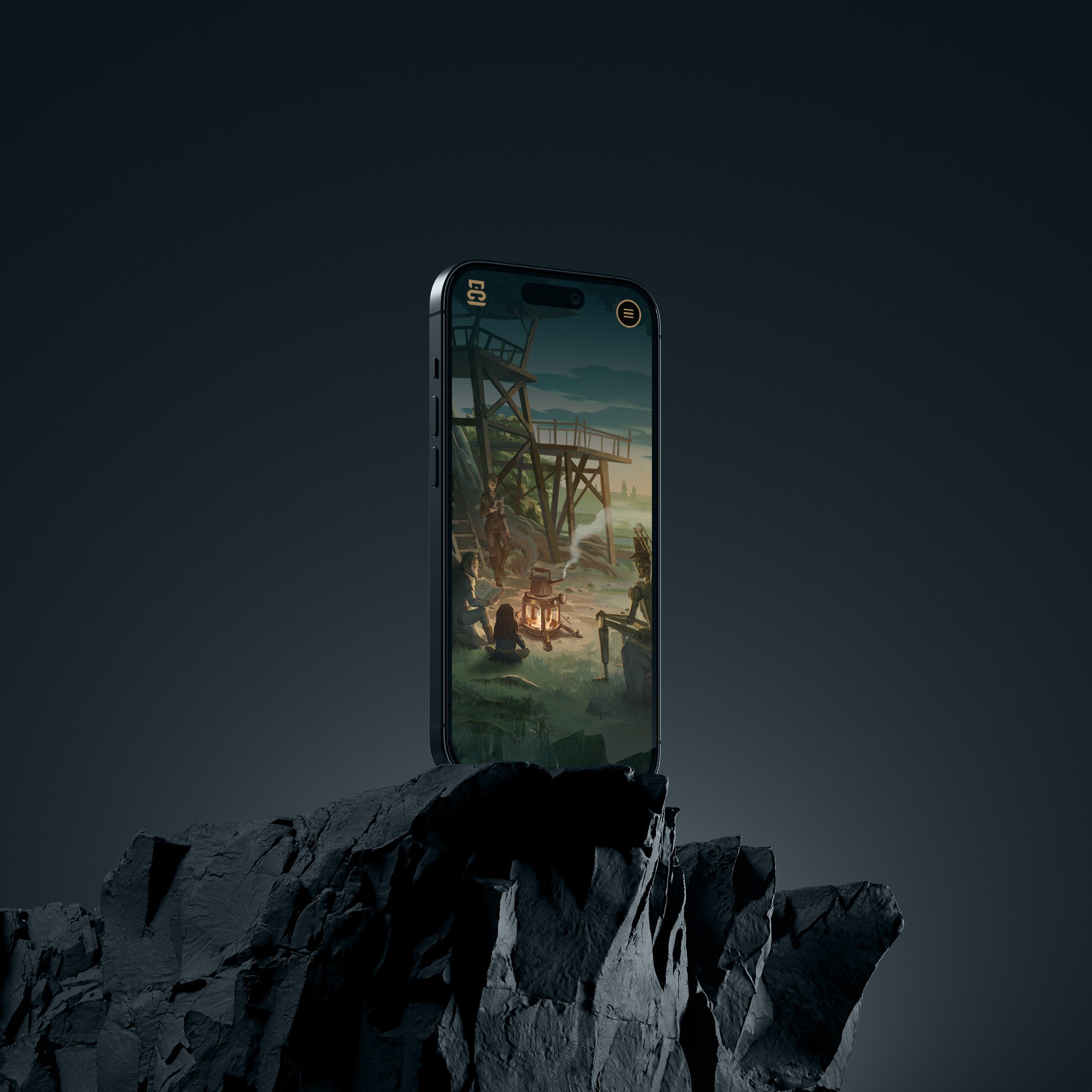
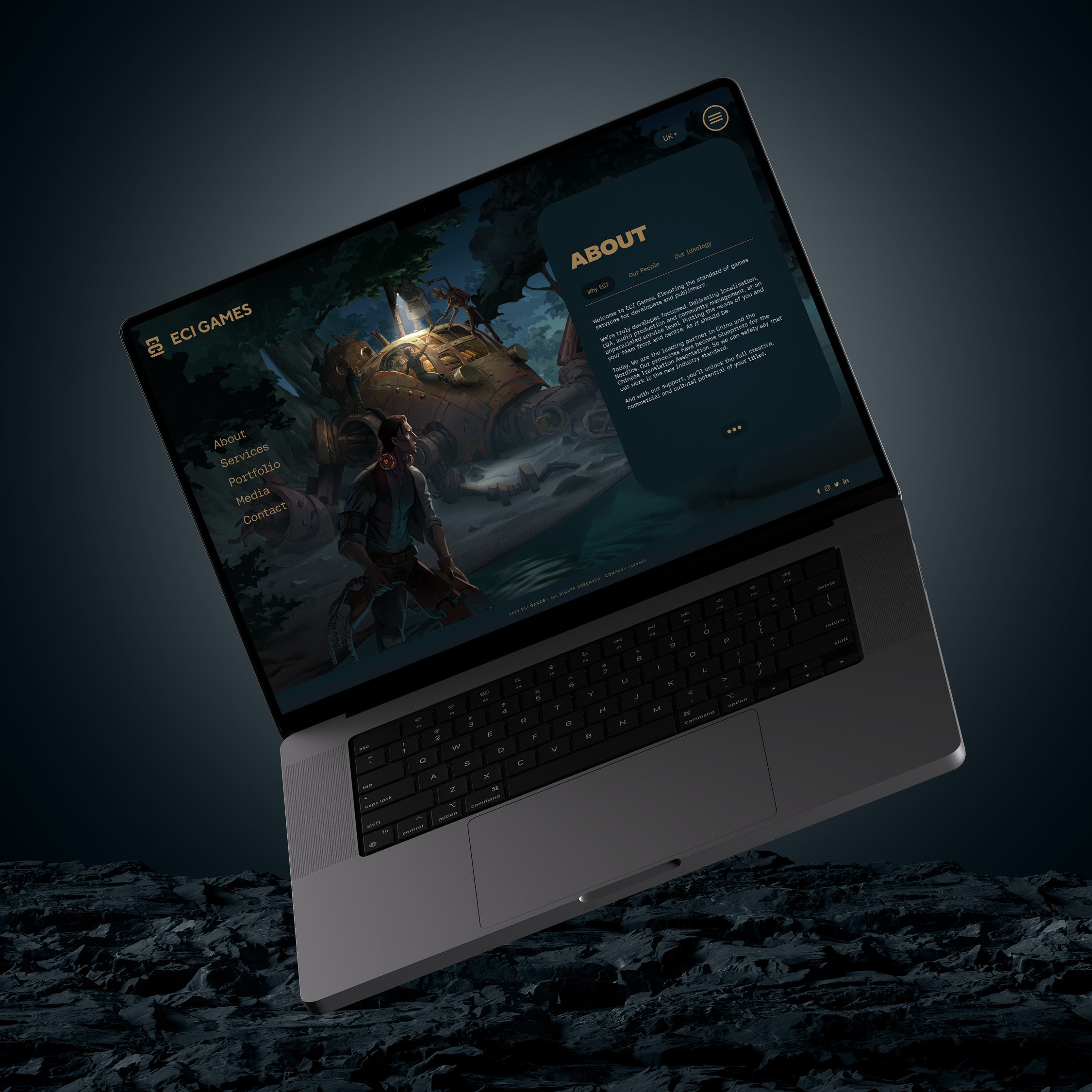
ECI Games asked Magick to design an identity that would resonate with games developers. To them, this meant creating a brand rooted in the symbolism and visual language of the video games industry.
Unlike competitors in the space.
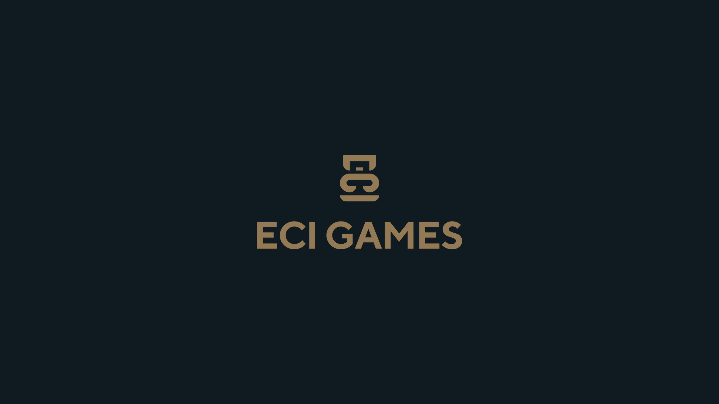
The logo, takes the acronym ECI and turns the letter forms 90 degrees to create a playful character. Each form designed to mimic Chinese calligraphy - acknowledging the brands heritage. The logo is paired with a traditional gold and teal primary palette, and sans serif logotype. Motion enables our character to emote - doubling down on the idea of empathy for both developers and players.


